Branding and logo design
A logo that only looks good on letterhead is half a logo. We design marks that also work on a phone screen, in a profile picture and on a building front.
- Delivered as
- Vector and bitmap
- Separately
- Or with the build
What you get
An identity that works everywhere
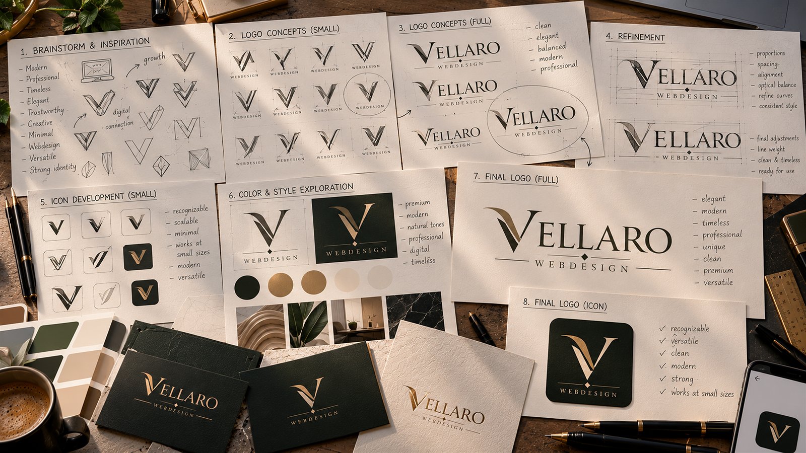
Not just a drawing, but the rules around it. Without those rules a visual identity falls apart within a year.
-
The logo in every variant
Horizontal and square, in colour and in one colour, for light and dark backgrounds. Delivered as a vector file, so it stays sharp at any size, and as bitmap for everyday use.
-
Colours with fixed values
For screen and for print, with the contrast ratios included. A brand colour that produces unreadable text on a website is not a usable brand colour.
-
Typography
A typeface that suits the brand and that may be used on a website. Plenty of beautiful typefaces do not meet that last condition.
-
A short identity document
Setting out how the logo should be used, how much space belongs around it, and what is not allowed. About five pages, not a manual nobody reads.
Why logo and website together makes sense
A logo designed separately from the website often disappoints on screen: lines too fine to survive, colours with too little contrast, or a shape that does not fit a square profile picture.
If we design both, we test the logo straight away in the place it will be seen most. That produces a more usable identity, and it saves a round of corrections later.
Already have a logo?
Then we use it. We do not redraw existing logos and we do not change the shape or the typography without instruction. If a vector version is missing, we can make one so the logo stays sharp at any size.
Identity and website in one go?
Indicate in the quote form that you have no visual identity yet, and we will include it in the proposal.